OneJS UI Components
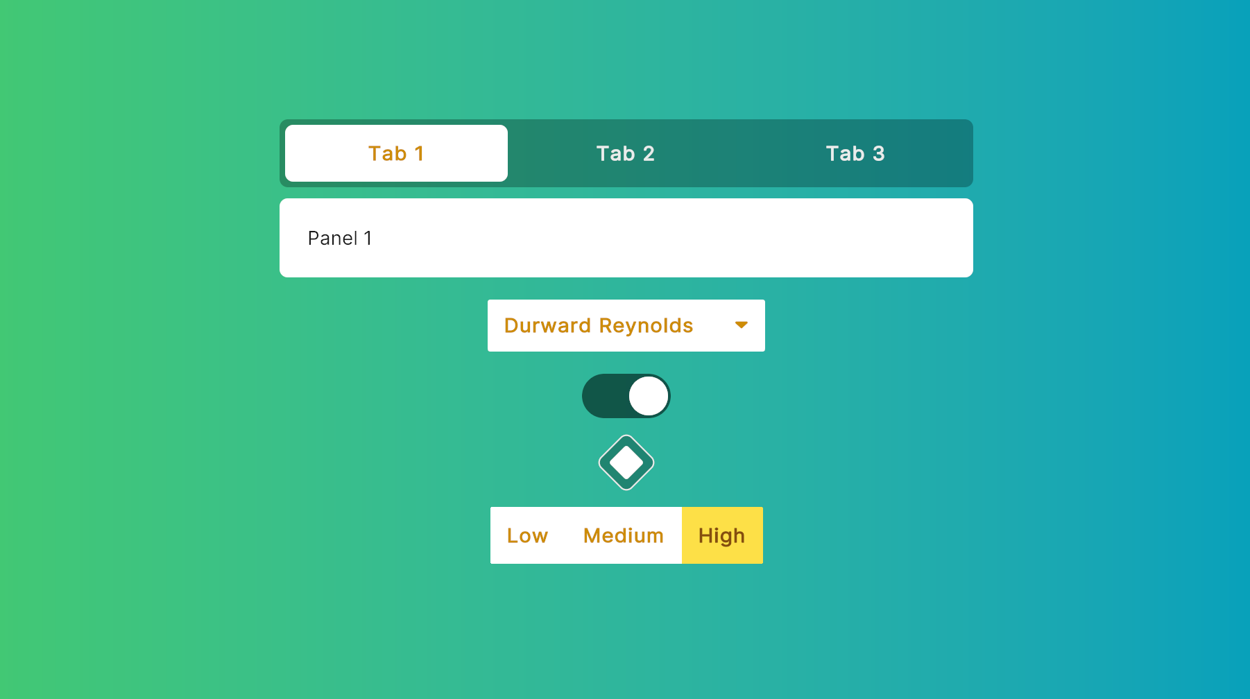
npm i onejs-compsInspired by Headless UI, OneJS offers a collection of unstyled UI components available as a NPM package. These minimal components also serve as handy references. You can use them as-is or customize them to fit your needs.
<gradientrect class="w-full h-full justify-center items-center" colors={[c("#42c873"), c("#06a0bb")]}>
    <ExampleTabs class="mb-4" />
    <Select class="min-w-[200px] mb-4" items={people} onChange={setSelectedPerson} />
    <Toggle class="mb-4" checked={checked} onChange={setChecked} />
    <DiamondToggle class="mb-4" checked={checked2} onChange={setChecked2} />
    <RadioToggle class="mb-4" items={tiers} onChange={setSelectedTier} />
    <Slider class="mb-4 w-[300px]" />
</gradientrect>
Click for Full Code
import { Slider, DiamondToggle, Toggle, Select, RadioToggle, ExampleTabs } from "onejs-comps"
import { parseColor as c } from "onejs/utils/color-parser"
import { h, render } from "preact"
import { useEffect, useState } from "preact/hooks"

const people = [
    { id: 1, name: 'Durward Reynolds' },
    { id: 2, name: 'Kenton Towne' },
    { id: 3, name: 'Therese Wunsch' },
    { id: 4, name: 'Benedict Kessler' },
    { id: 5, name: 'Katelyn Rohan' },
]

const tiers = [{
    label: 'Low',
    value: 'low',
}, {
    label: 'Medium',
    value: 'medium',
}, {
    label: 'High',
    value: 'high',
}]

const App = () => {
    const [selectedPerson, setSelectedPerson] = useState(people[0])
    const [selectedTier, setSelectedTier] = useState(tiers[0].value)
    const [checked, setChecked] = useState(false)
    const [checked2, setChecked2] = useState(false)

    useEffect(() => {
        console.log(`Selected person: ${selectedPerson.name}`)
    }, [selectedPerson])

    useEffect(() => {
        console.log(`Selected tier: ${selectedTier}`)
    }, [selectedTier])

    useEffect(() => {
        console.log(`Toggle: ${checked}`)
    }, [checked])

    useEffect(() => {
        console.log(`Toggle 2: ${checked2}`)
    }, [checked2])

    return <gradientrect class="w-full h-full justify-center items-center" colors={[c("#42c873"), c("#06a0bb")]}>
        <ExampleTabs class="mb-4" />
        <Select class="min-w-[200px] mb-4" items={people} onChange={setSelectedPerson} />
        <Toggle class="mb-4" checked={checked} onChange={setChecked} />
        <DiamondToggle class="mb-4" checked={checked2} onChange={setChecked2} />
        <RadioToggle class="mb-4" items={tiers} onChange={setSelectedTier} />
        <Slider class="mb-4 w-[300px]" />
    </gradientrect>
}

render(<App />, document.body)
Headless UI Comps
Misc Samples
Toggle
import { Switch, Toggle, DiamondToggle } from "onejs-comps"
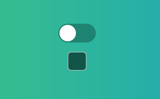
Toggle is the simplest comp here. If you are new with all this headless UI stuff and Render Props, you should just start with checking out the source code for Toggle. <Switch /> is the headless component. <Toggle /> and <DiamondToggle /> are example comps using <Switch />.
Sample <Switch /> Usage
const Toggle = ({ class: classProp, children, checked, onChange, style }: ToggleProps) => {

    return <Switch class={`w-16 h-8 rounded-[16px] p-[2px] ${checked ? 'bg-[rgba(0_0_0_0.8)]' : 'bg-[rgba(0_0_0_0.5)]'} transition-[background-color] duration-200 ${classProp}`} checked={checked} onChange={onChange} style={style}>
        {({ checked }) => (
            <div class={`w-[28px] h-[28px] bg-white rounded-full ${checked ? 'translate-x-[32px]' : 'translate-x-0'} transition-[translate] duration-200`} />
        )}
    </Switch>
}

const DiamondToggle = ({ class: classProp, children, checked, onChange, style }: ToggleProps) => {

    return <Switch class={`w-8 h-8 p-[6px] rounded-md border-[1px] ${checked ? 'border-[rgba(255_255_255_0.8)] bg-[rgba(0_0_0_0.5)] rotate-[45deg]' : 'border-[rgba(255_255_255_0.5)] bg-[rgba(0_0_0_0.8)] rotate-0'} transition-[background-color,rotate] duration-200 ${classProp}`} checked={checked} onChange={onChange} style={style}>
        {({ checked }) => (
            <div class={`w-[18px] h-[18px] bg-white rounded-sm ${checked ? 'flex' : 'hidden'}`} />
        )}
    </Switch>
}
Select
import { Listbox, Select } from "onejs-comps"
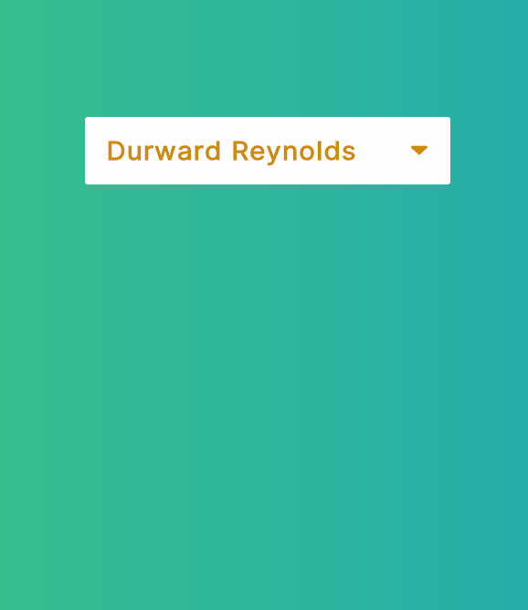
Select implements a dropdown using the headless Listbox comp. The most interesting thing here is how Listbox works around UI Toolkit's lack of z-index. Check out the source code for Listbox.Options for that.
Sample <Listbox /> Usage
const Select = ({ class: classProp, items, index, onChange, style }: SelectProps) => {
    index = index || 0
    const [selectedItem, setSelectedItem] = useState(items[index])

    useEffect(() => {
        onChange && onChange(selectedItem)
    }, [selectedItem])

    return <Listbox class={`relative ${classProp}`} items={items} index={index} onChange={setSelectedItem}>
        <Listbox.Button class={`default-bg-color active-text-color bold rounded-sm px-[12px] py-[10px] flex-row justify-between`}>
            <div class="">{selectedItem.name}</div>
            <FAIcon name="down-dir" class="active-text-color translate-y-[1px]" />
        </Listbox.Button>
        <Listbox.Options class="default-bg-color default-text-color rounded-sm py-2 mt-2">
            {items.map((item, i) => (
                <Listbox.Option index={i} class={`hover:hover-bg-color hover:active-text-color px-[12px] py-[10px] flex-row justify-between`} item={item}>
                    {({ selected }) => <Fragment>
                        <div class={`bold ${selected ? 'active-text-color' : ''}`}>
                            {item.name}
                        </div>
                        {selected ? <FAIcon name="ok" class="active-text-color translate-y-[1px]" /> : null}
                    </Fragment>}
                </Listbox.Option>
            ))}
        </Listbox.Options>
    </Listbox>
}
Radio Group
import { RadioGroup, RadioToggle } from "onejs-comps"
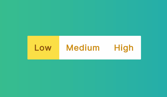
RadioToggle demonstrates how to use RadioGroup to design your own multi-choice toggle comp.
Sample <RadioGroup /> Usage
const RadioToggle = ({ class: classProp, items, index, onChange, style }: RadioToggleProps) => {
    index = index || 0

    function onChangeIndex(index: number) {
        onChange && onChange(items[index].value)
    }

    return <RadioGroup class={`flex flex-row rounded-sm overflow-hidden default-bg-color active-text-color bold ${classProp}`} index={index} onChange={onChangeIndex}>
        {items.map((item, i) => (
            <RadioGroup.Option class={({ checked }) => `${checked ? "accented-bg-color highlighted-text-color" : "bg-white"} p-3 transition-[background-color] duration-200`} index={i}>
                {({ checked }) => <Fragment>{item.label}</Fragment>}
            </RadioGroup.Option>
        ))}
    </RadioGroup>
}
Tab
import { Tab, ExampleTabs } from "onejs-comps"
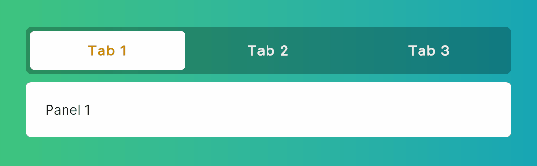
Sample <Tab /> Usage
ExampleTabs demonstrates Tab.Group, Tab.List, and Tab.Panels usage.
const ExampleTabs = ({ class: classProp, style }: ExampleTabsProps) => {

    function onChange(index: number) {
        console.log(`Tabs index changed to ${index}`)
    }

    return <Tab.Group class={`flex-col w-[500px] ${classProp}`} onChange={onChange} style={style}>
        <Tab.List class={`flex-row justify-between rounded-md bg-black/50 p-1 mb-2`}>
            {exampleTabs.map((tab, index) =>
                <Tab name={tab.label} index={index} class={({ selected }) => (classNames(`flex-row rounded-md text-white/80 items-center bold justify-center p-3 transition-[background-color] duration-200`, selected ? `bg-white active-text-color` : `hover:bg-white/10`))} style={{ width: `${98 / exampleTabs.length}%` }}>{tab.label}</Tab>
            )}
        </Tab.List>
        <Tab.Panels>
            {exampleTabs.map((tab, index) =>
                <Tab.Panel class={`bg-white rounded-md p-5`}>{tab.content}</Tab.Panel>
            )}
        </Tab.Panels>
    </Tab.Group>
}
Transition
import { Transition } from "onejs/comps"
Using Transition and Transition.Child together is a great way to animate multiple components at the same time and make them respond to the same state change.
Click for Full Code
const App = () => {
    const [show1, setShow1] = useState(true)
    const [show2, setShow2] = useState(true)

    return <gradientrect class="w-full h-full flex-row justify-center items-center" colors={[c("#42c873"), c("#06a0bb")]}>
        <div class="w-64 h-64 justify-center items-center">
            <div class="h-32 w-32 mb-8">
                <Transition
                    class="h-full w-full"
                    show={show1}
                    appear={true}
                    enter="transition[opacity,rotate,scale] duration-[400ms]"
                    enterFrom="opacity-0 rotate-[-120deg] scale-50"
                    enterTo="opacity-100 rotate-0 scale-100"
                    leave="transition[opacity,rotate,scale] duration-200 ease-in-out"
                    leaveFrom="opacity-100 rotate-0 scale-100"
                    leaveTo="opacity-0 scale-75"
                >
                    <div class="h-full w-full rounded-md bg-orange-200" />
                </Transition>
            </div>
            <button onClick={() => setShow1((show1) => !show1)} text="Toggle" />
        </div>
        <div class="w-64 h-64 justify-center items-center">
            <div class="h-32 w-32 mb-8">
                <Transition class="h-full w-full flex-row justify-around" show={show2} appear={true}>
                    <div class="h-full w-[48%]">
                        <Transition.Child class="h-full w-full"
                            enter="transition[translate,opacity] duration-[400ms]"
                            enterFrom="opacity-0 translate-y-[20%]"
                            enterTo="opacity-100 translate-y-[0]"
                            leave="transition[translate,opacity] duration-200 ease-in-out"
                            leaveFrom="opacity-100 translate-y-[0]"
                            leaveTo="opacity-0 translate-y-[20%]"
                        >
                            <div class="h-full w-full rounded-md bg-orange-200" />
                        </Transition.Child>
                    </div>
                    <div class="h-full w-[48%]">
                        <Transition.Child class="h-full w-full"
                            enter="transition[translate,opacity] duration-[400ms]"
                            enterFrom="opacity-0 translate-y-[-20%]"
                            enterTo="opacity-100 translate-y-[0]"
                            leave="transition[translate,opacity] duration-200 ease-in-out"
                            leaveFrom="opacity-100 translate-y-[0]"
                            leaveTo="opacity-0 translate-y-[-20%]"
                        >
                            <div class="h-full w-full rounded-md bg-orange-200" />
                        </Transition.Child>
                    </div>
                </Transition>
            </div>
            <button onClick={() => setShow2((show2) => !show2)} text="Toggle" />
        </div>
    </gradientrect>
}
Slider Sample
import { Slider } from "onejs-comps"

This is a pure-JS implementation of a Slider component. Free feel to copy and modify according to your own needs.
// Example usage
<Slider class="w-[200px]" onChange={onChange} />
Color Picker Texture Fill
This one is a simple example of calling custom C# job from JS.
// colorpicker-sample.tsx
import { GradientTextureFillJob } from "OneJS/Utils"
import { Color, Color32, Texture2D, TextureFormat } from "UnityEngine"
import { Slider } from "onejs-comps"
import { parseColor as c } from "onejs/utils/color-parser"
import { h, render } from "preact"
import { useEffect } from "preact/hooks"

var texture = new Texture2D(200, 200, TextureFormat.RGBA32, false)
var colors = texture.GetRawDataColor32()

const App = () => {

    useEffect(() => {
        onChange(0)
    }, [])

    function onChange(v: number) {
        var hueColor = Color.HSVToRGB(v, 1, 1)
        GradientTextureFillJob.Run(colors, 200, 200, new Color32(hueColor.r * 255, hueColor.g * 255, hueColor.b * 255, 255))
        texture.Apply()
    }

    return <gradientrect class="w-full h-full justify-center items-center" colors={[c("#42c873"), c("#06a0bb")]}>
        <image class="mb-4" image={texture} />
        <Slider class="w-[200px]" onChange={onChange} />
    </gradientrect>
}

render(<App />, document.body)
GradientTextureFillJob.cs
[BurstCompile]
public struct GradientTextureFillJob : IJobParallelFor {
    public NativeArray<Color32> colors;
    public int width;
    public int height;
    public Color32 topRightColor;

    // Convenience static method for easy calling from JS for example
    public static void Run(NativeArray<Color32> colors, int width, int height, Color32 topRightColor) {
        var job = new GradientTextureFillJob {
            colors = colors,
            width = width,
            height = height,
            topRightColor = topRightColor
        };
        job.Schedule(colors.Length, 64).Complete();
    }

    public void Execute(int index) {
        int x = index % width;
        int y = index / height;
        float fx = (float)x / (float)width;
        float fy = (float)y / (float)height;

        Color32 leftColor = Color32.Lerp(Color.black, Color.white, fy);
        Color32 rightColor = Color32.Lerp(Color.black, topRightColor, fy);
        Color32 pixelColor = Color32.Lerp(leftColor, rightColor, fx);

        colors[index] = pixelColor;
    }
}